Overview
So, you’ve followed Mayer’s principles and created some visual aids for your learning materials – but are they effective? Are they engaging? Are they contributing to learning? Are they accessible to a wide range of users? In this module we take a closer look at graphic design principles and apply them to the planning, design and creation of effective learning materials for print, online or blended learning environments. As we work through these design principles and try out some tools, see if you can spot Mayer’s principles at work.
We’ll also take a look at examples and your own work through the lens of accessibility. Inclusive Design Principles and the Universal Design for Learning guidelines will help you develop strategies for adding accessibility to your workflow so that inclusion is built into your media and multimedia learning design. We’ll explore creating infographics, a powerful medium for representing ideas and concepts, and experiment with text to speech screen readers, one of the most commonly used adaptive tools for learning.
Learning Outcomes
By the end of this module you will be able to:
- Describe the difference between equality and equity
- Describe three design principles aimed at creating inclusive experiences
- List five factors in the design of text, images and video that impact accessibility
- Describe a workflow change to media or multimedia design and development that would improve accessibility
- Identify the three grounding principles of Universal Design for Learning (UDL)
- Apply a principle of Universal Design for Learning to a media or multimedia learning object design
- Identify five visual design principles involved in the design of a learning object
- Apply Cognitive Load Theory and Mayer’s principles to presentation design
- Use a graphic design tool to create an infographic to illustrate a concept or idea
- Use a screenreader to access digital content
Read/Watch
- How Captions Increase ROI and Audience for Media Creators (8 min) – Who benefits from accessibility modifications? And what are some design choices that benefit everyone?
- Making Videos Accessible: DO-IT Video (washington.edu)(10 min) – An introduction to the accessibility features that can be built into online video.
- Inclusive Design for Social Media: Tips for Creating Accessible Channels (hootsuite.com) (10 min) – Practical advice on how to avoid excluding people using assistive technologies from your social media sites – applicable to many other forms of media (ignore the sales pitch)
- Creating Accessible Text (7 min) – A demonstration of how to make digital text more accessible to screen readers.
- Universal Design for Learning (7 min) – An introduction to UDL and its use in the classroom
- 8 Basic Design Principles to Help You Create Better Graphics (15 min) – These basic principles can make a big difference in the look and feel of your media/multimedia materials.
- How to Avoid Death By PowerPoint | David JP Phillips | (20 min) – Some key advice on how to use Powerpoint more effectively.
- How to Create an Infographic – Part 1: What Makes a Good Infographic? (10 min) – An overview of the steps to building a good infographic
- White Space in Infographic Design: Why It Matters (3 Min)- How to use white space, or negative space, effectively in your infographic design (one of the most overlooked principles of graphic design)
Resources
- Universal Design for Learning Guidelines (10 – 20 min) – Strategies for implementing the principles of Universal Design for Learning in designing for teaching and learning. I don’t expect you to read the whole site but bookmark this site so that you can refer back to it throughout the course.
- WAVE Chrome, Firefox, and Edge Extensions (webaim.org) – WAVE accessibility checker for the web
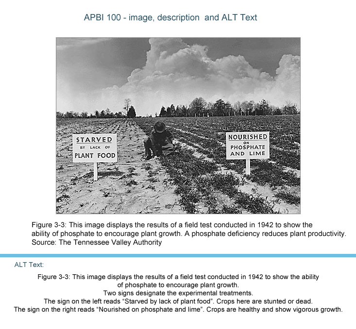
- Poet Image Description (diagramcenter.org) – How to create effective image descriptions for your alt tags
- WCAG – Contrast Checker – Not sure if your text colour is dark enough? Check the contrast here.
- What is Canva and why should you use it? – A quick primer for people who have never used Canva before.
- Finding Images and Attribution – A tutorial to assist you finding images that are not subject to copyright restrictions.
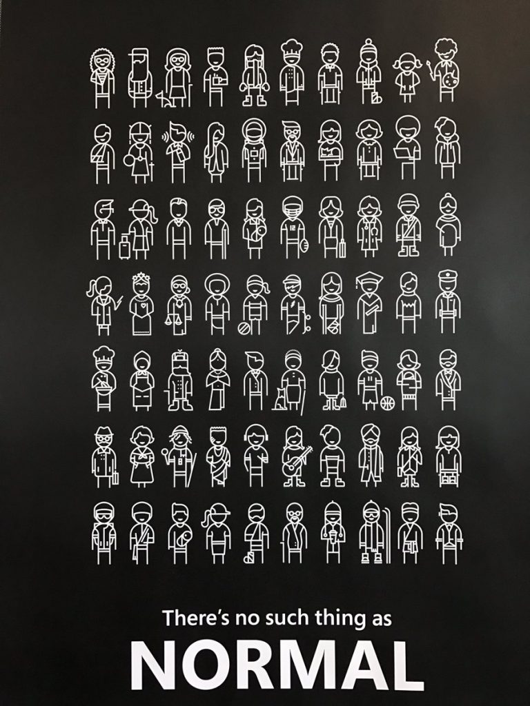
Accessibility and Equity
“Disability is a mismatch between a person’s abilities and their environment”
Kat Holmes, Mismatch
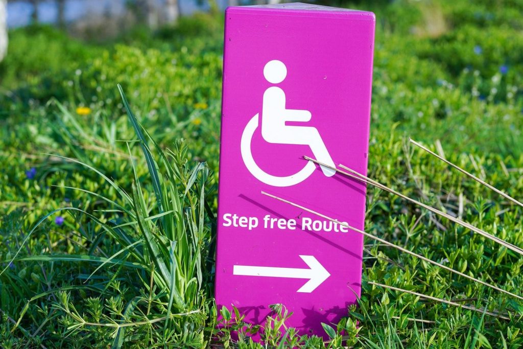
When we incorporate an understanding of accessibility and equity into our designs for media and multimedia learning experiences we create a better experience for everyone. Captioning, transcripts, descriptive video, alt tags – these not only remove barriers, they also create multiple pathways for other learners. Incorporating accessibility factors into our multimedia design flow helps us avoid excluding learners and ultimately creates a better learning experience for everyone.
Kat Holmes has developed three inclusive design principles, adopted by Microsoft and other technical designers, that seek to remove barriers. At the heart of these design principles is the recognition that disability isn’t a lack of ability, it’s a mismatch between a person’s abilities and their environment (Holmes, 2019). Our goal as teachers and learning designers is to create learning environments that can match a wide range of abilities.
1. Recognize Exclusion
“Exclusion happens when we solve problems using our own biases. Seek out exclusions as opportunities to create new ideas and inclusive designs.” (Holmes, 2019)
Think about the ‘edge cases’ in your learning group, the people with needs that are outside of the usual range. What design choices will exclude or impair their ability to access your learning environment? What choices could you make to remove or mitigate those barriers?
2. Solve for One, Extend to Many
“Designing for people with disabilities actually results in designs that benefit people, universally” (Holmes, 2019)
The primary use case for closed captioning in video is people with hearing impairments. But research shows that it also helps people learning the language, people listening with the sound off, and people who need more time to process information (Gernsbacher, 2015). The accessibility you build into your learning design creates a better learning experience for everyone.
3. Learn from Diversity
“Human beings are the real experts in adapting to diversity. Inclusive design puts people at the center at the very start of the process.” (Holmes, 2019)
If you have the opportunity to test out your media/multimedia project, look for diversity in your test group. Learn from the experts – the people who are already adapting to a world not designed for them. What adaptive tools and technologies are they using? How can you design your media or multimedia learning project to work most effectively with them? Or can you design it in such a way that those adaptive tools are not needed?
These design principles have been adopted by Microsoft and other technical designers and engineers to avoid excluding users from their environments. Keep them in mind as you build your own media and multimedia to ensure that they include a wider range of learners.
Practical Design Choices
So how do we incorporate these inclusive principles into our design choices as we create blog posts, screencasts, videos and other multimedia content? Here are a few promising practices to start with:
Text
- Use a simple, sans serif font that’s easy to read
- Use plain language and avoid unnecessary jargon
- Follow grammatical rules and use upper and lower case appropriately
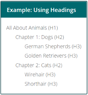
- Use HTML for headings and subheadings instead of bold or underline or centering
- Use descriptive links rather than spelling out a full URL (i.e., EDCI 337 course site vs. https://edtechvic.ca/edci337)
- Don’t use colour as an organizing tool on your page
- Ensure that there is enough contrast between the text colour and the background
Video
- Add captions and edit them for accuracy.
- Add descriptions of visual elements in the video.
- Download a transcript of your video and add it to your page.
- Give users full playback controls so that they can control the pace and rewind as needed.
- Use streaming servers for your video that can adapt to varying bandwidths
Images
- Always include alt text when you add an image to your page if the image is not decorative.
- Make sure that the alt text is descriptive and useful to someone who can’t see the page.
- If the image contains text, include that in the alt text or consider putting the text elsewhere where a screen reader can read it.
There are many more design considerations that could be included in this list but this is a good place to start.
Universal Design for Learning
Universal Design for Learning is a framework that grew out of research in cognitive neuroscience and the learning sciences, including some of the research on Cognitive Load and the Cognitive Theory of Multimedia Learning that we’ve been exploring this term. The framework promotes the use of flexible learning environments and learning spaces designed to accommodate a wider range of learner needs. Like the inclusive design principles, the research shows that this flexible learning design results in a better learning experience for all learners.
How do these guidelines apply to interactive and multimedia learning?
Engagement
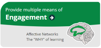
Building user controls into media and multimedia players gives learners control over the speed and sequence of their learning, optimizing individual choice and autonomy. Removing extraneous load, applying Mayer’s principles, removes distractions. You can build collaboration into your use of media and multimedia by creating assignments and activities that engage a group and by using tools that allow for sharing and connection. You can create learning objects and lessons that reflect authentic learning and give meaningful feedback to support mastery. And finally, you can use media and multimedia platforms as a reflection tool to promote self-assessment skills.
In this course, we use WordPress as platform for reflection, for shared learning, and as an authentic learning project by building a portfolio that can be adapted for future professional uses. We make goals and objectives available up front and we give you the flexibility to create projects that follow your own needs and interests.
Representation
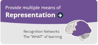
Providing alt tags, captions and transcripts and providing user controls such as speed, rewind, and next buttons, gives learners the opportunity to customize their learning and provides alternative visual and auditory channels to process information. Structuring your content so that key terms and concepts are highlighted and connected will create better learning outcomes.
You may notice in this course that we define the meaning of key terms like multimedia and interactivity up front and use multiple media types to explore content. We also refer back to principles and concepts that we’ve already covered, or you may have seen before, in order activate background knowledge, and highlight the patterns, big ideas and relationships between concepts. This is also Mayer’s principles at work, helping you manage the intrinsic cognitive load of the learning in this course.
Action and Expression
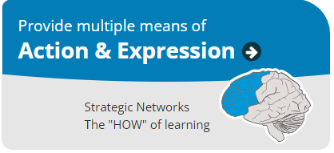
With media production tools becoming more and more accessible, allowing students to express their ideas and construct and compose assignments through multiple means, such as text, audio, video and images, can more easily be accommodated.
You may also notice that the To Do lists and the structure of these modules help to support executive function by helping you with your planning and information management. By exploring and using a variety of tools in this course, we are helping you build fluency and providing support for practice and performance.
Like Mayer’s principles, we will be returning to UDL guidelines throughout this course. They provide a solid framework for a learner-centred approach to design that creates better learning experiences for everyone.
Design Principles
With the tools that are available to us now, we can create quite sophisticated media and multimedia learning materials. But the effectiveness of our materials can be undermined by a lack of experience with basic graphic design principles. While we may never develop professional skills in this area, there is a lot we can do to improve the quality of our work and ultimately, create a better learning experience. Research has shown that it’s not just the addition of visual elements that improves learning, but the addition of well-designed visual elements (Mayer, 2012).
So as you work with Canva to create infographics this week, keep these graphic design principles in mind (and identify in your blog post when you’re using it in your own work or recognizing it in someone else’s):
- Focus on alignment
- Use hierarchy to help focus your design
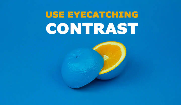
- Leverage contrast to accentuate important design elements
- Use repetition to your advantage
- Consider proximity when organizing your graphic elements
- Make sure that your designs have balance
- Optimize colour to support your design
- Leave lots of negative space
Presentations
Presentation skills are essential to any professional, but for educators it is particularly important. Being able to design and create effective Powerpoint slides to support your presentation will create a much better learning experience for your audience.
In the video Death by Powerpoint in the Read/Watch activities this week, David Phillips doesn’t make explicit reference to multimedia learning theory, but it’s important that we identify the theories that underlie the insights that were shared. Here are some of the key takeaways from the TEDx talk in the context of multimedia learning theories. As we talked about earlier, everything we do in this course is connected to these theories and principles. Make sure that you refer to them in your projects, posts and comments and point out the connections in your work:
| Key Takeaway | Multimedia learning theory/principle |
| Only 1 idea per slide | Cognitive load theory, Segmenting |
| No more than 6 objects per slide | Cognitive load theory |
| Don’t read text off your slide. Let your audience read it. | Redundancy principle |
| Use an illustrative image and short text on a slide, and then tell the rest of your story via narration | Multimedia and modality principles |
| Make sure the most important thing on your slide is the most prominent | Signalling principle |
| Use contrast to move your audience around the information on your slide | Signalling and coherence principles |
Explore: Accessibility Tools and Infographics
WAVE Accessibility Checker
Plug the URL for your post for Module 1 in this WAVE Accessibility Checker. Take a screenshot of your results so that you can share it in your blog post. What surprised you about the findings? What will you change going forward? This WAVE Documentation will help you interpret the results.
Text to Speech/Screen Readers
Text to Speech tools, or screen readers, are some of the most commonly used adaptive tools available. Synthetic speech has been around since the 1950s but only recently has the technology progressed to the point where synthetic speech is close enough to pass for normal speech. Originally designed for people with hearing impairments, many people use them now as an assist or an alternative to reading long texts.
Some of you may already be familiar with these tools and use them as a regular part of your studies. If that’s the case, try a different tool below and see if the experience is better or worse than the familiar one. Try out some different voices and think about the principles we’ve looked at so far – what effect does the narrator voice have on your learning? Does the pace of learning change when you’re listening vs. reading?
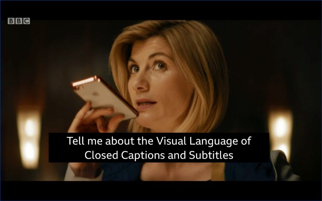
Check out this screen reading example posted on Twitter by Kent Dodds. What effect does using non-font characters have on the screen reader?
Try one of these tools:
- Read Aloud for Chrome and Firefox (How to use the Read Aloud browser extension)
- Voice Dream – for Mac users only
- Speechify Available on: Chrome | Android | iOS
- NaturalReader – available on web and chrome extension
- TTSReader Chrome extension | Android | iOS | Web
Then use the reader to read parts of this blog post and one of your blog posts.
What do you notice about the way it reads this page? If you closed your eyes would you have a good idea of what we were talking about?
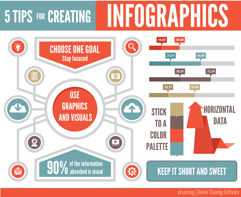
Infographics with Canva
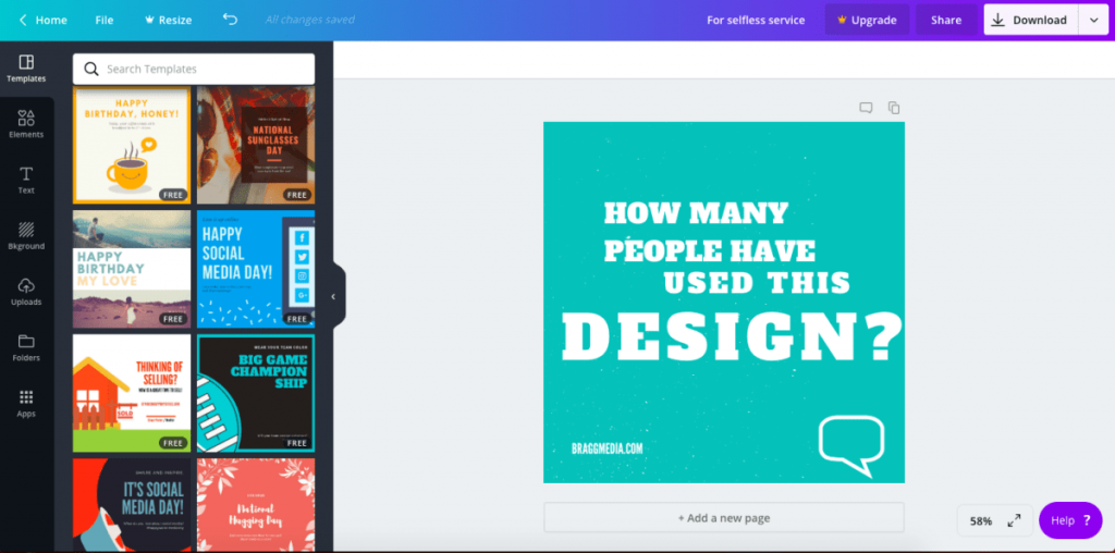
Infographics are a powerful tool for organizing and presenting information and telling a story. Research has shown that a well-designed illustration combining text and image can help learners understand a concept, and remember it longer, than a text document alone (Levine & Lentz, 1982). There are a lot of tools out there to help you create posters or infographics (e.g., Visme, Easelly) but one of the most widely used by non-professionals is Canva. The University of Victoria Library has a number of resources to help set you up to try this out.
If you don’t already have a free Canva account, go to their web site and set one up. If you’re already very familiar with Canva, try Visme or Easel.ly (with free accounts only). If you’ve always used templates in the past, try creating one from scratch.
Choose a concept in this course, another course that you’re taking, or just something that you’re curious about and create an infographic that illustrates something about it. Keep the subject narrow enough that you can encompass it in a single infographic. Download your infographic and add it to your blog post. Avoid using Generative AI tools or following a template too rigidly – you’ll learn more if you really explore what the tool can do.
Six promising practices for infographic design:
- Limit your colour palette
- Keep imagery simple
- Be consistent with style choices
- White space is a good thing
- Two fonts is more than enough
- Size matters – use it to create a hierarchy of information
(Easel.ly, 2021)
Reflections
Use these questions as prompts for creating your blog posts. You’re not obliged to answer them all and you’re welcome to add your own questions to the mix. Make sure that you include a screenshot of your WAVE accessibility report and your infographic in your blog post.
- What did you find when you ran the WAVE accessibility report on your blog post(s)? What did you expect and what was surprising? Is there anything you will do differently going forward? This WAVE Documentation will help you interpret the results.
- Have you used Text to Speech tools before? Did you find it useful? Did you try out some of the different voices? What impact did the different voices have on your ability to absorb information?
- What role do you think media and multimedia can play in a learning environment designed with UDL guidelines in mind? Which of the promising practices for text, images and video are in alignment with these guidelines?
- What does inclusive design mean to you?
- Which design principles did you follow to create your infographic in Canva? Which elements of a ‘good infographic’ were you able to incorporate? What other principles did you consider? What does using a template or generated design make easier and what does it make harder when creating your infographic? Did your target audience influence your choices?
- Graphic design is inherently visual – what additions or modifications could you make to ensure that learners with visual impairments have access to the same information in an infographic in an online setting?
To Do
- Read/watch the weekly Announcements forum posts in Brightspace (or in your email inbox if your notifications are set up that way).
- Run a WAVE accessibility check on your WordPress site.
- Try out a Text to Speech tool (see some suggestions in the Explore section above).
- Create an infographic in Canva following the design principles in this module.
- Create a blog post using some of the questions in the Reflection section above or follow your own thinking. Make sure to include your explorations in this module in your post – a screenshot of your WAVE report and your Canva infographic (see the Explore section above).
- Comment on at least one other post in your class.
Bibliography
Ready for a deeper dive into these concepts and ideas? Check out these resources below:
Creative Commons Licensed Workshop Curriculum | UVic Libraries Digital Scholarship Commons. (n.d.). Retrieved Sept 28, 2022, from https://oac.uvic.ca/dsc/workshops/lessonplans/
Johnson, D. (2021, February 19). Design and Layout with Canva [Mp4]. https://www.youtube.com/watch?v=g3pdyid7BjU
Levie, W & Lentz, R. Effects of Illustrations: A Review of Research (1982) ECTJ, Vol 30 No. 4, Pages 195-232
McCue, R. (2021, February 20). Introduction to Infographics with Canva & Related Multimedia Learning Principles [MP4]. https://www.youtube.com/watch?v=K1k3deWbw2c
Easel.ly, Crash Course in Infographics Webinar, Accessed Sept 28, 2022
Brame, C.J. (2015). Effective educational videos. Retrieved [22/09/2022] from http://cft.vanderbilt.edu/guides-sub-pages/effective-educational-videos/.
Cahill, Caitlin, How to Make Text Accessible to People with Disabilities : Caitlin Cahill, from The Geek You Need, Retrieved [22/09/2022]
Gernsbacher MA.(2015) Video Captions Benefit Everyone. Policy Insights Behav Brain Sci. 2015 Oct;2(1):195-202. doi: 10.1177/2372732215602130. Epub 2015 Oct 1. PMID: 28066803; PMCID: PMC5214590.
Holmes, K. (2020). Mismatch: How inclusion shapes design. MIT Press.
Inclusive Design (2018) Microsoft Design Principles
Wantuch, Michelle (2021), Designing for neurodivergent students: What we’ve learned so far – Microsoft Research